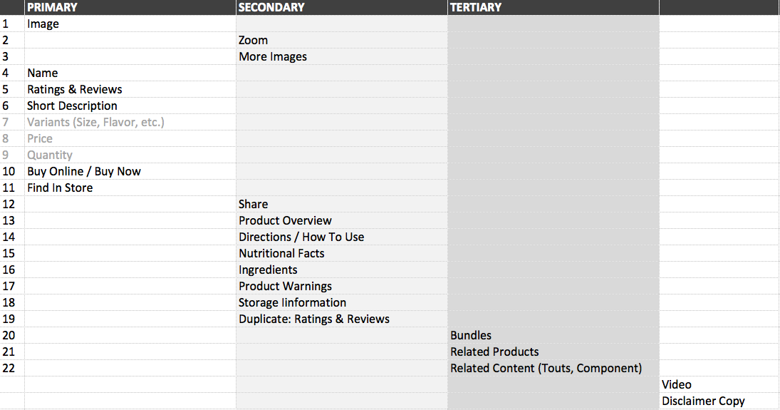
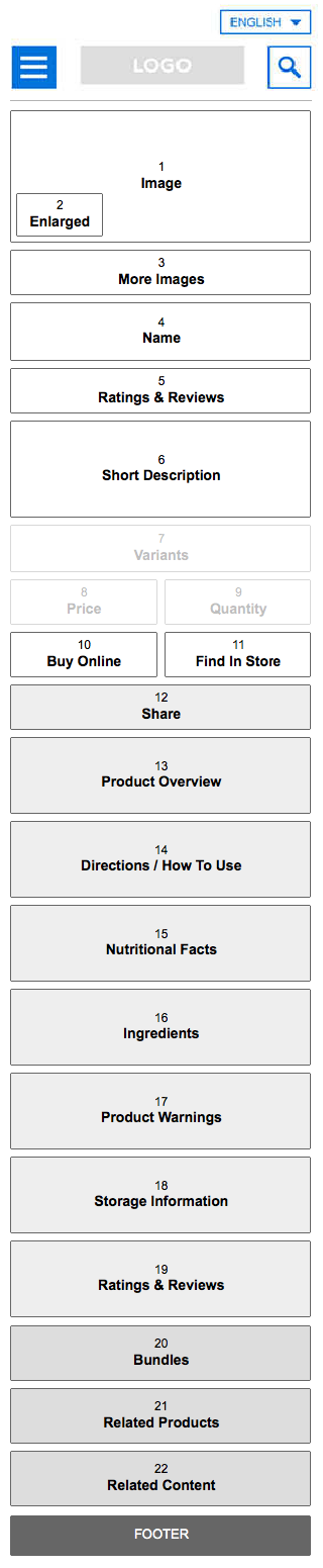
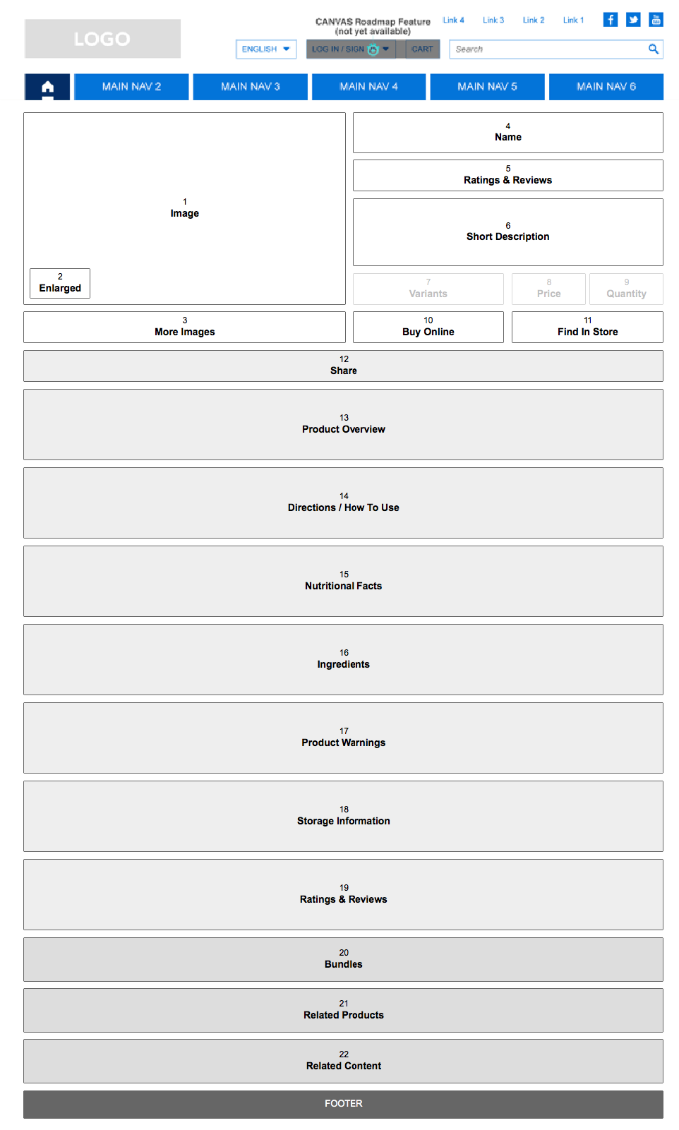
1
Template was not scalable
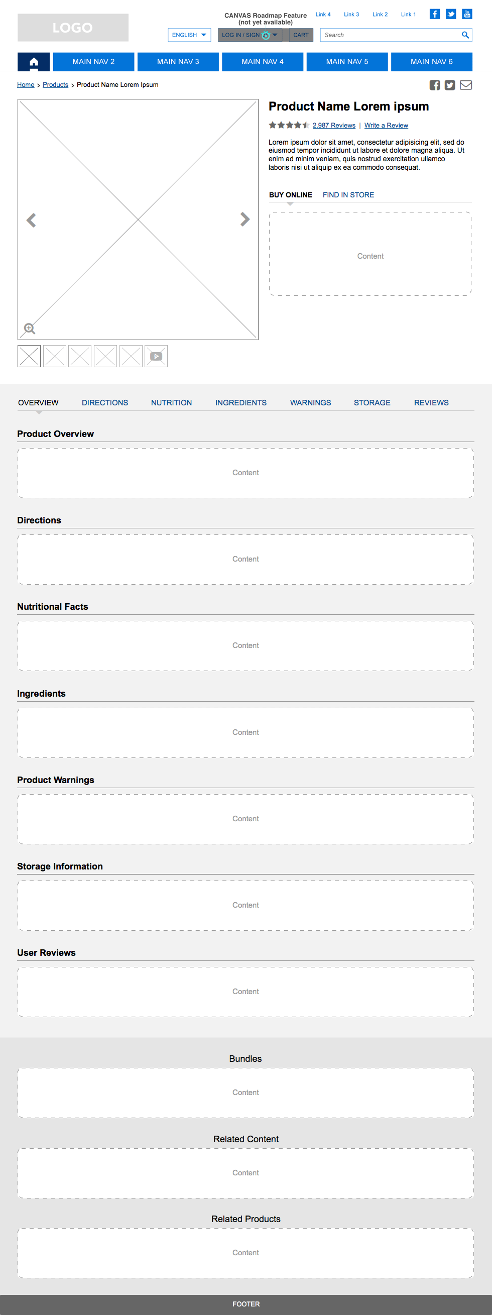
Many brands required different functional modules that were not included in the original page template, such as a "Where to Buy" module or direct-to-consumer CTAs.
Many brands required different functional modules that were not included in the original page template, such as a "Where to Buy" module or direct-to-consumer CTAs.
2
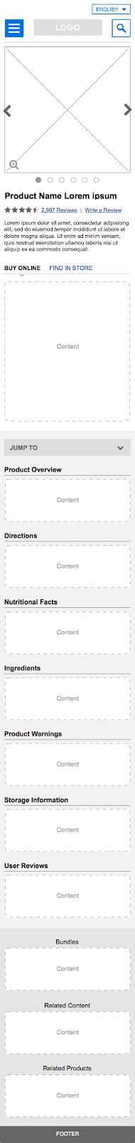
Layout was clumsy
The existing template featured a large product image on the left and accordions on the right but lacked guidelines for image sizes and content lengths. This led to inconsistent and inefficient page layouts.
The existing template featured a large product image on the left and accordions on the right but lacked guidelines for image sizes and content lengths. This led to inconsistent and inefficient page layouts.
3
Limit the use of accordions
The client opposed the use of accordions, believing they harmed SEO, despite evidence to the contrary. Therefore, any new solution had to present content without hiding key information.
The client opposed the use of accordions, believing they harmed SEO, despite evidence to the contrary. Therefore, any new solution had to present content without hiding key information.

.gif)
